Code
# Import the usual libraries
import pandas as pd
import numpy as np
import matplotlib.pyplot as plt![]()
![]()
![]()

![]()
Which platform should I choose?
📖 Review the Lecture notes
# Import the usual libraries
import pandas as pd
import numpy as np
import matplotlib.pyplot as pltIn this lab we will work with geophysical data from one of your fellow (former) graduate students Fawz Naim: Estimating Compressional Velocity and Bulk Density Logs in Marine Gas Hydrates Using Machine Learning, by Fawz Naim, Ann E. Cook, Joachim Moortgat. A short abstract describing this work:
P-wave velocity (\(V_p\)) and bulk density (\(\rho_b\)) are essential physical properties in shallow marine sediments. For example, \(V_p\) and \(\rho_b\) are used for characterizing natural gas hydrate, understanding shallow natural hazards and are required, fundamental components for tying well data to seismic data. Herein, we present a highly-accurate machine learning approach that predicts \(V_p\) and \(\rho_b\) in near-seafloor sediments which can be used in intervals or locations where data is unavailable or poor-quality. We use scientific quality logging-while-drilling (LWD) data and compare five machine learning-algorithms; we find that Random Forest algorithm outperform other algorithms in predicting \(V_p\) and \(\rho_b\) in water saturated sediments, as well as in sediments with natural gas hydrates in fractures and natural gas hydrates in pores.
In more laymen terms: petroleum- and other companies may drill (exploration) wells in different parts of the world and collect various types of information from those wells, referred to as well logs. These logs can include, e.g., gamma ray, bulk density, neutron porosity and resistivity. Each of those, and combinations, can be used to determine certain rock properties as a function of depth throughout the vertical extent of the well. Every company does not perform the full suite of logs in each well, though, for obvious economic reasons. So in this work Fawz explores whether we can train Machine Learning algorithms to reconstruct a missing well log from the logs that are available.
Fawz explored linear regression, non-linear regression, random forest methods, k-nearest-neighbor, and an artificial neural network for this purpose. In this lab, you’ll try out multivariate nonlinear regression models. Of course you can also contrast this with multivariate linear regression using code from the previous lab in this week. We may return to these data to try out the last 3 aforementioned machine learning approaches in a future lab.
Fawz’s paper consider various different combinations of available versus missing logs. In this lab, we will consider the following combination of features and target:
You don’t really need to understand what those are (google or LLM if interested), just that we have 3 physical features to predict one target.
The data we will use are organized as follows:
We have a single spreadsheet Training_Data_Vp_Case1.csv that contains data for 22 different wells (i.e. at lots of different geographical locations). Each measurement is for a given depth and has the values for gamma-ray, bulk density, resistivity, and \(p\)-wave velocity. In total there are 34,341 different measurements. Note that Fawz already put those measurements in random order in this file, so if you want to plot a log versus depth, for instance, you’d want to sort the values by depth.
We also have two separate spreadsheets WR313-G_Vp_Case1.csv and WR313-H_Vp_Case1.csv from completely separate wells. We can use the data from those well as a truly independent test set of our trained machine learning algorithms.
Heads up: this lab involves messy and complicated real data that may in fact not be modeled very well with the multivariate non-linear regression used here. We’ll essentially follow the (incomplete) path of your fellow SES student in trying to make sense of these data with ML tools.
One of the easiest ways to get data into a jupyter notebook on Colab is to import from a github repository, which has special links to raw data files.
The code below is just a single line, doesn’t use any special extra python modules, and loads the comma-separated-values (csv) file straight into a python pandas dataframe. As always, feel free to just copy the same URL into your browser to see that the data look like and/or download and open in your favorite spreadsheet program (or perhaps Matlab if you’re more familiar with that). The file is also available on Carmen.
df = pd.read_csv("https://raw.githubusercontent.com/jmoortgat/Hydrate/main/Training_Data_Vp_Case1.csv")Check the header of this dataframe, which shows columbus for ‘Depth’ (mostly useful for plotting), ‘GR’ for gamma-ray, ‘RHOB’ for bulk density, ‘RES’ for ring resistivity, and ‘Vp’ for our target \(p\)-wave velocity.
df.head()| Depth (mbsf) | GR | RHOB | RES | Vp | |
|---|---|---|---|---|---|
| 0 | 513.0952 | 71.54287 | 1.969237 | 0.309480 | 1667.604 |
| 1 | 512.9428 | 76.18578 | 1.969107 | 0.320824 | 1673.023 |
| 2 | 513.8572 | 71.61407 | 1.992180 | 0.392803 | 1655.831 |
| 3 | 162.8800 | 86.89611 | 1.846918 | 0.458114 | 1549.503 |
| 4 | 514.0096 | 72.73511 | 1.991311 | 0.459769 | 1659.237 |
Remember that you can select a single column by its header name:
df['Depth (mbsf)']| Depth (mbsf) | |
|---|---|
| 0 | 513.0952 |
| 1 | 512.9428 |
| 2 | 513.8572 |
| 3 | 162.8800 |
| 4 | 514.0096 |
| ... | ... |
| 34336 | 112.4356 |
| 34337 | 112.5880 |
| 34338 | 150.3832 |
| 34339 | 150.6880 |
| 34340 | 150.5356 |
34341 rows × 1 columns
If you want to select multiple columns in the same way, you need a list (‘tuple’) of column names, which requires an addition set of square brackets:
df[['GR', 'RHOB']]| GR | RHOB | |
|---|---|---|
| 0 | 71.54287 | 1.969237 |
| 1 | 76.18578 | 1.969107 |
| 2 | 71.61407 | 1.992180 |
| 3 | 86.89611 | 1.846918 |
| 4 | 72.73511 | 1.991311 |
| ... | ... | ... |
| 34336 | 60.42717 | 2.649200 |
| 34337 | 57.63063 | 2.623869 |
| 34338 | 56.91296 | 2.555415 |
| 34339 | 57.73565 | 2.454775 |
| 34340 | 57.01653 | 2.514134 |
34341 rows × 2 columns
Btw, if instead of columns you want to select one or more rows of a pandas dataframe, you can use the df.iloc[] notation. To select just the first 4 rows of data (i.e. automatically excluding the headers from the indices):
df.iloc[0:4]| Depth (mbsf) | GR | RHOB | RES | Vp | |
|---|---|---|---|---|---|
| 0 | 513.0952 | 71.54287 | 1.969237 | 0.309480 | 1667.604 |
| 1 | 512.9428 | 76.18578 | 1.969107 | 0.320824 | 1673.023 |
| 2 | 513.8572 | 71.61407 | 1.992180 | 0.392803 | 1655.831 |
| 3 | 162.8800 | 86.89611 | 1.846918 | 0.458114 | 1549.503 |
df.columns as I showed in an earlier lab.df dataframe. You could have a look at the .head() of this new dataframe to check that it looks as expected.numpy arrays, using our customary notation of \(x\) for the array of features (don’t worry about the bias), and \(y\) for the target.np.shape to check the dimensions of your features and target and compare some of the numerical values in each to the .head() of the dataframe above to make sure everything looks good.# Create numpy arrays of features and target# check values and shape of numpy arraysYou already saw in most of the previous lectures and labs notebooks how to manually split your data into training and validation subsets. Here I show another way of doing this using one of sklearn’s functions (and using a relatively large fraction of 30% as validation data):
from sklearn.model_selection import train_test_split
#Split data into train and test datasets
X_train, X_val, Y_train, Y_val = train_test_split(x, y, test_size=0.3)
--------------------------------------------------------------------------- NameError Traceback (most recent call last) <ipython-input-11-423dff7e214a> in <module> 1 from sklearn.model_selection import train_test_split 2 #Split data into train and test datasets ----> 3 X_train, X_val, Y_train, Y_val = train_test_split(x, y, test_size=0.3) NameError: name 'x' is not defined
np.shape(X_train)As another illustration of how to write functions in python, here are 2 examples that calculate the R2 score (instead, or in addition to, getting those out of sklearn LinearRegression) and the Mean Absolute Percentage Error (MAPE).
def R_2(y_pred, y_true):
    corr_matrix = np.corrcoef(y_pred, y_true)
    corr = corr_matrix[0,1]
    R_sq = corr**2
    return (R_sq)

def MAPE(y_pred, y_true):
    y_pred, y_true = np.array(y_pred), np.array(y_true)
return np.mean(np.abs(y_pred - y_true)/np.abs(y_true))*100To get you to some results quickly, let’s ‘cheat’ a little again and use a pre-packaged sklearn function to generate polynomial features out of our physical 3 features. Let’s start with a 4th-order polynomial in all 3 features. The syntax is very similar to how sklearn LinearRegression works but in this case we are only adding features, including cross-terms like, e.g., RHOB * GR * RES\(^2\).
from sklearn.preprocessing import PolynomialFeatures

make_poly = PolynomialFeatures(degree=4)
X_poly_train = make_poly.fit_transform(X_train)
X_poly_val = make_poly.fit_transform(X_val)
Can you calculate how many features we get by using a 4th-order polynomial in 3 variables? Check by looking at the np.shape of X_poly_train or X_poly_val.
To be clear, the target \(y\) of course doesn’t change when we explore any order of polynomial in the features.
After you’ve finished the 4th order regression below, come back here and try higher- or lower-order polynomials. If you try degree=1, you should just get a linear regression.
np.shape(X_poly_train)Next, perform the actual linear regression in your polynomial (higher-order/non-linear) features. I didn’t load sklearn LinearRegression yet, so you’ll have to load it here, or add to the very first code cell above where we loaded the other modules.
Exercises for you:
LinearRegression.fit: fitting Y_train to X_poly_train,LinearRegression.predict to get the predictions of the trained model both for your (polynomial) training data X_poly_train and your validation data X_poly_val. Name these predictions Y_pred_train and Y_pred_val.Y_pred_train versus Y_train (i.e. predicted versus measured target values in the training data set) and Y_pred_val versus Y_val (for the validation data). How do those compare? Are both good, both bad, or one good and one bad? What does that mean?plt.scatter plot. You can then add a lineplot, e.g., plt.plot(Y_val,Y_val) or simply plt.plot(y,y) for all data, which is a one-to-one line showing what a perfect fit would look like. Make such plots for both training and validation data (either as subplots, or in two different code cells/figures).from sklearn.linear_model import LinearRegression
# Add code for linear regression here, as we've used in previous labs
# Of course you're free to try the baked-in LinearRegression as the easiest option
# and/or try our explicitly coded gradient descent, stochastic gradient descent, mini-batch gradient descent, or accelerated Newton method
# To use our own codes, you may have to do min-max rescaling of our features,
# which is explained in the first simpler part of this lab for multivariate linear regression.
# This is explained further in a section below.# Make predictions based on features in training data, as well as for your validation data:# Compute R2 accuracy (and/or other measures, like MAPE) between predicted and true values for target y, p-wave velocities:# Make a scatter plot of predictions on training data versus true measured values, and add a linear lineplot of y vs. y to visualize the scatter (variance) in your predictions:# Do the same for your validation data:What you are likely to see is that your predictions for the training data have less scatter around the 1-to-1 perfect fit plot than what you see for your validation data. As mentioned in the previous lab and in the last lecture, this typically occurs when some of your validation data are outside the min-max range of your training data. Higher-order polynomial fits perform poorly in extrapolating.
Such outliers can significantly degrade the R2 score of your fit, even if, say, 95% of your validation data can be predicted at high accuracy with your polynomial model. There are many ways to improve on this. The more robust ways involve checking (and adjusting) the ranges of your input features. An easier way is to elimate some of the outlier predictions and then re-computing your R2 scores for the remainder (perhaps >95% or >99%) of your predictions. Or, instead of eliminating some predictions altogether, we can just use some cut-off thresholds on the predictions.
Let me give you some illustrative code of how to do the latter (and I’ll let you explore some other options), because it shows some useful python/numpy tricks. Let’s calculate the minimum and maximum of your predictions on your training data. Then, if your prediction on validation data (or on any future measurements) is larger than that maximum or smaller than that minimum of training data, we just set those values to the max or min of training data, respectively. This can be done as follows (note that you may have chosen different variable names, so adjust accordingly):
  y_min = np.min(prediction_train)
  y_max = np.max(prediction_train)

  prediction_val[prediction_val<y_min] = y_min
  prediction_val[prediction_val>y_max] = y_max
so the above code takes array prediction_val and modifies only the elements in that array that satisfy the condition in square brackets (indexing), which is prediction_val<y_min or prediction_val>y_max in this case. You can also use this notation to, for instance, set all negative values to zero: prediction_val[prediction_val<0] = 0. Or if some array \(A\) inadvertedly contained some not-a-number, NaN values, you could use A[np.isnan(A)] = 0(numpy also has other specific functions to achieve this, such as .nan_to_num()).
Play around with this and see if, and how much, you can improve your R2 score on your validation data. Perhaps it makes more sense to limit your predictions to the min/max of the actual \(y\) measurements, for instance.
Note that because all \(>30,000\) measurements across 22 individual wells are already randomly shuffled in the data spreadsheet, it is not straightforward to make nice plots of predicted \(p\)-wave velocities vs depth, as compared to the actual measured \(p\)-wave values, but we’ll do so below as part of the next exercise.
Performing a training-validation split of measurements as we have done above (and in earlier labs and lectures), is not an entirely fair or robust way to validate how well your model, polynomial or otherwise, will perform for new measurements in the future. The reason is that those validation data were randomly selected from the same 22 wells that we used to train the model. If 22 wells is not sufficient to fully represent all possible wells, your predictions may not be accurate for an entirely new/different well. So to test this, we have set asside 2 completely independent wells as a more robust test of our model accuracy (also on Carmen in this week’s Module).
We can use the same python/pandas syntax as above to load the data for these two additional wells into two separate dataframes vs1 and vs2:
vs1 = pd.read_csv("https://raw.githubusercontent.com/jmoortgat/Hydrate/main/WR313-G_Vp_Case1.csv")
vs2 = pd.read_csv("https://raw.githubusercontent.com/jmoortgat/Hydrate/main/WR313-H_Vp_Case1.csv")
You can use .head() again to see what these data look like. They are organized the same as before, but now for just one well each, and the measurements are not randomized/shuffled. In other words, they are monotonic in well-depth. This means we can plot our measured, and later predicted, values of \(p\)-wave velocity versus depth. You can do so after turning the data into numpy arrays, or even directly for columns of the dataframe. For example:
plt.figure(figsize=(6,16))
plt.plot(vs1['Vp'], -vs1['Depth (mbsf)'],linewidth=1);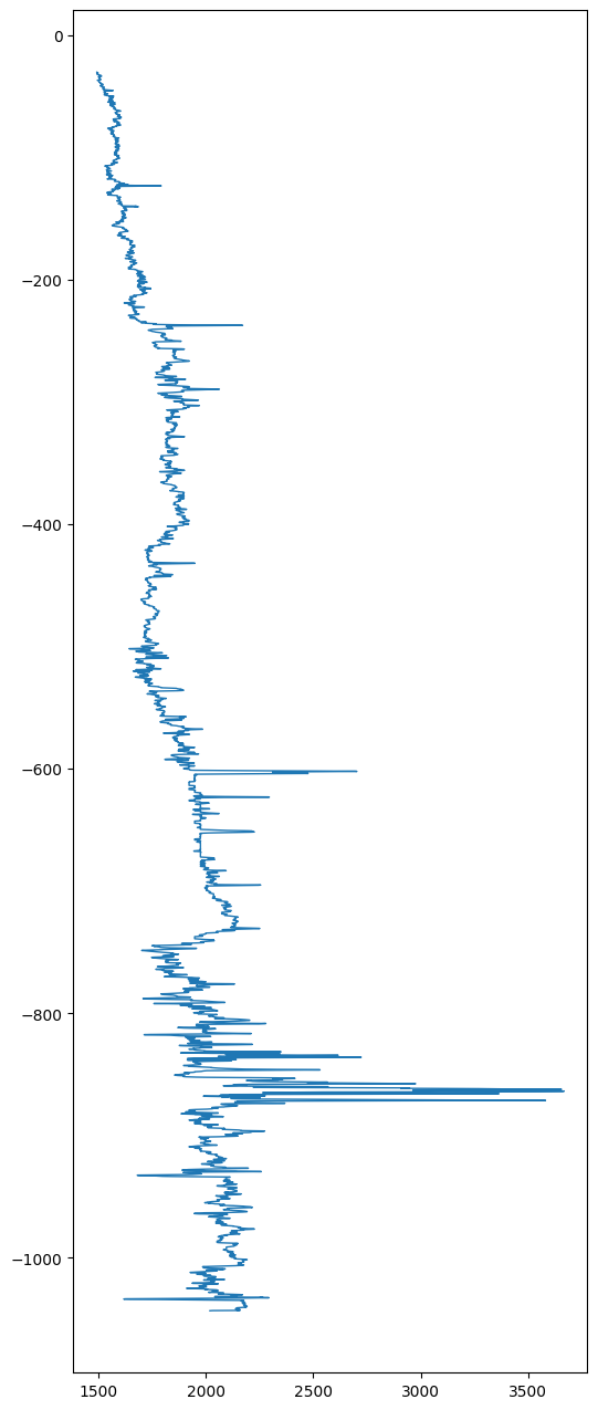
Note that normally you would put the independent variable (feature) on the horizontal axis and the dependent variable (target) on the vertical axis, but well logs typically show the depth on the vertical axis and the varying log (\(p\)-wave velocity in this case) on the horizontal axis, so that’s how I plotted it. I also plotted depth as negative values below the sea-floor for this application. Finally, these plots obviously look better if you elongate the vertical axis, instead of having a default square figure.
We already have a trained model, so the exercise here is simply to use that trained model to make predictions for this new set of feature measurements and see how well it compares to the actual \(p\)-wave velocities for these two independent wells. In other words, carry out these steps (for both wells, or just one if you don’t have time to try both): * Define feature array \(x\) for each well (or just one to try), * Generate the 4th order polynomial features into a similar array as before (maybe use a different variable name), * Use LinearRegression.predict to predict the \(p\)-wave velocities (our target \(y\)) from the polynomial features, * Calculate the fitting error, as R2 (and perhaps MAPE if you’re interested) between predicted \(y\) for these test wells versus the measured \(y\) in each of these test wells (i.e. taken from the dataframes vs1 and/or vs2), * Plot predicted target vs measurement as above. * And finally, now we can also make a more intuitive plot where you show both measured- and predicted \(p\)-wave velocities versus depth (in other words, the same plot as above, but adding one more line that will add the predictions to the same plot).
# Define features x and target y as numpy arrays:# define polynomial features just like you did for the training and validation data# make a prediction of y for the features in this test well, using the same .predict() function as before# Compute R2 accuracy of predictions vs true y measurements for independent well(s)# make a scatter plot of predictions vs true values of y (p-wave velocity) and add straight line for measured y vs y (perfect fit)# Plot both predicted and measured y versus (minus) depth.If you haven’t already, you should check the min, max, and mean of each of your features, and do so both before and after you generate your polynomial features. For the former, you can also just simply look at the spreadsheet of data. What you’ll see is that the gamma-ray (GR) data, in the reported units, are about \(50\times\) larger than the other two features. Moreover, once we generated 4th order polynomial terms, some of the features have exceedlingly large values indeed. That means that the gradients, which we use in gradient descent optimization, are also (numerically) order of magnitude larger for some features than for others.
If you wanted to try and solve this machine learning problem with our own (stochastic, mini-batch or regular) gradient descent method, it would likely not work! To do so (which of course I encourage anyone to do who wants to develop a deep understanding of these methods), you would want to do min-max scaling of the polynomial features before doing the regression (actually, if you do min-max scaling to a range of 0-1 for your original physical features, then the polynomial features will of course automatically also be in the 0-1 range, because the 4th power of the maximum value of 1 is still 1).
sklearn also has routines to make this easy. I’ll just give you some example code in case you perhaps want to use this in the future.
from sklearn.preprocessing import MinMaxScaler
scaler = MinMaxScaler()

# you'll likely have to change variable names if you want to try this.
X_train_scaled = scaler.fit_transform(X_train)
X_val_scaled = scaler.transform(X_val)
X_test_scaled = scaler.transform(X_test)
Clearly, though, it appears that LinearRegression already does this type of rescaling internally, so it you try this in the context of this lab, the results may not change.
I will add one important note to the issue of feature scaling, just so that you are aware: if you rescale your features and then fit a model (whether linear or non-linear), the actual fitting parameters, \(\theta\), are of course in terms of those rescaled features. If you want to apply your trained model to make predictions on new measurements, you have 2 options: 1) rescale your new measurement of \(x\) by the same xmin/xmax used for your training data (which are typically not the min/max values of new measurements, or 2) rescale your fitting parameters so they can be applied to unscaled new measurements.
Let me illustrate with the simplest possible example. Let’s say you want to fit a linear model with zero intercept to a feature \(x\) that runs from 0 - 100, i.e. you want to fit \(y = \theta x\).
You could first rescale your feature to a range of 0-1 by dividing by a (constant) value of \(x_\mathrm{max}=100\), so \(\tilde{x} = x/x_\mathrm{max} = x/100\). So now you are instead fitting \(y = \tilde{\theta} \tilde{x}\). Assume that your best fit to some noisy data gives you a slope of \(\tilde{\theta} = 4\). Now you have a new measurement of \(x=35\). Your options are to either first rescale this new measurement to \(\tilde{x} = 35/100 = 0.35\) and your prediction is \(y = \tilde{\theta} \times 0.35 = 1.4\).
Or, after fitting your model you adjust/rescale your fitting parameters to \(\theta = \tilde{\theta}/x_\mathrm{max} = 0.04\) and you can apply this model directly to your ‘raw’ new feature measurement \(x\) to get the same result \(y = \theta x = 0.04 * 35 = 1.4\). I would say that this option is more desirable, because it is a model in terms of unaltered physical input features.
Machine learning, as many other tools in science and engineering, is not immune to the ‘garbage-in-garbage-out’ phenomenon. Whether numerical regressions or the more complex neural networks that we’ll discuss later in the semester, by packaging these algorithms into easy to use software like sklearn (or various other widely used GUI software like SPSS) it is tempting to just feed in all your data, and simply report on the results without further thought. More often than not, though, you can quite significantly improve your results by having a proper scientific understanding of your data.
In the context of this lab/applications, for example, it is important to realize that each of the measured well logs don’t operate at the same vertical resolution. The data spreadsheet I shared has been re-sampled such that we have matching values for gamma-ray, bulk density, and resistivity as input features and \(p\)-wave velocities as our target, but in practice these are all (or perhaps some) measured at different resolutions (i.e. at more or fewer depths). This means that some features are likely more noisy than others. In terms of physics, you could also imagine that a sound-wave-type velocity depends on some average of, say, bulk densities and porosities over a certain depth interval rather than the very local values measured by some high-resolution logs. By thinking through the physics, we might therefore realize that perhaps we get a better prediction by considering a moving average of \(p\)-wave predictions over a certain depth interval.
To explore this, I define a function that performs such a moving average over a number of points that can be adjusted by you, the user.
def smooth(y, box_pts): #moving average filter for downsampling the outputs
    box = np.ones(box_pts)/box_pts
    y_smooth = np.convolve(y, box, mode='same')
    return y_smooth
You can apply this function to ‘smooth’ your predictions of \(p\)-wave target \(y\), for instance over 7 depth values:
# you may have to change test_pred to your own variable name
y_pred_smooth = smooth(test_pred, 7)
Now you can check whether or not this improves the predictions (it should). Of course you probably have to adjust some variable names to make this work with your other code.
R_2(y_pred_smooth,y_t)After doing this, you could plot the true values of \(p\)-wave velocity again and compare it now to your smoothed predictions, which should look a little better.
# Plot smoothed predictions versus true yIn this lab, you explored (almost) the full complexity of multivariate non-linear numerical regression as an important Machine Learning tool to model a real (Earth) Science problem. Specifically, we considered how we can use available well-log information to predict (parts of) other well logs that may not be available in certain areas. While you probably did not find a perfect fit to the actual measurement data, you should have achieved reasonably impressive R2 scores of around 80% on quite complex, non-linear, and noisy measurements. In your figures of predicted and measured \(p\)-wave velocities versus depth, you should have seen that we can predict the overal trends quite well with a 4th (or perhaps you tried even higher-orders?) polynomial fit, but don’t quite fit some of the higher-resolution peaks.
In a future lab, we may explore how other ML methods, like Random Forests, can do even better for such data. Hopefully, you also took away the lesson that ‘feature engineering’ and knowing your data can significantly improve model performance.
I said ‘almost the full complexity’ in the first statement, because later you will also learn how ‘regularization’ of model complexity can further improve numerical (and logistical = classification) regression algorithms.
Already this early in the course, I hope you’re starting to feel more comfortable with coding in python and using some pretty powerful ML techniques that can be applied to a wide array of typical science (and data analytics more generally) problems.
Next week, you’ll learn how we can readily generalize these ideas even further to predict things where your target variable can only take on discrete values. For example, whether a pixel in a satellite image is water/land/grass/forest etc, which we can label as classes 1, 2, … , nr_classes. Those schemes are called logistic regression.
📖 Next module: Module 4: Classification