This week’s lecture notes are split into two separate notebooks.
This first notebook explains how to recognize and quantify when ML models are either underfitting (related to bias) or overfitting (related variance). To understand the definitions of bias and variance, first you need to learn about bootstrapping multiple representative data samples from a single set of measurements.
The second part teaches you how to ‘fix’ overfitting in particular through (Lasso or Ridge) regularization. As part of that, it also delves a little bit deaper into the concept of cross-validation.
Load libraries
As before, we may not need all the libraries below, but it doesn’t really hurt to always load a suite of common ML tools.
Bootstrapping is a statistical technique used to mimic the process of taking new random measurements from the data-generating process.
Suppose we have \(m\) data points in our training set: \(\{(x^{(1)}, y^{(1)}), (x^{(2)}, y^{(2)}), \dots, (x^{(m)}, y^{(m)})\}\).
To create a bootstrap sample, we draw \(m\) points with replacement from this dataset:
“With replacement” means the same original data point can be chosen multiple times, or not at all.
Each draw is independent and has equal probability \(\tfrac{1}{m}\) of picking any one of the \(m\) points.
The resulting bootstrap sample is also of size \(m\), but it may contain duplicates and miss some of the original points.
We then train a model on this bootstrap sample and record its predictions.
Repeating this process \(B\) times gives us \(B\) slightly different fitted models: \[
\hat{y}_1(x), \; \hat{y}_2(x), \; \dots, \; \hat{y}_B(x)
\]
Why does this help?
If we could repeatedly go out and collect \(m\) fresh measurements from the real world, we would see how the model varies across different datasets.
Bootstrapping mimics this process using only the data we already have.
✅ Key idea: Bootstrapping creates many “pseudo-datasets” of the same size as the original, which allows us to estimate how a model would behave if we truly repeated the experiment many times.
Definitions of Bias and Variance
When we evaluate how well a model performs, we try to minimize a cost or loss function. For numerical regression, we use the Mean Squared Error (MSE) and for classification we used the logistic cost function as the objective function to minimize. However, also for classification we can compute the MSE of model predictions (sigmoid probabilities) versus the true labels (we only chose/defined the logistic function because it behaves better for gradient descent methods, because it is a convex function).
It is important to understand 3 contributors to the MSE. At a given input point (measured features) \(x\), and across \(B\) bootstrap training sets, the MSE for a single point \(x\) can be decomposed into:
\(f(x)\) = the true function (data-generating process, without noise; for example \(f(x) = x^2\))
\(\hat{y}_b(x)\) = prediction at \(x\) from model fit on bootstrap sample \(b\)
\(\overline{\hat{y}(x)} = \frac{1}{B}\sum_{b=1}^B \hat{y}_b(x)\) = average prediction across bootstrap models
\(\sigma^2\) = variance of the measurement noise (irreducible error)
I will first give you the formal definition of each of these contributions and then guide you through some detailed visualizations. The latter should give you a thorough intuition/understanding of what bias and variance mean.
First, the technical definitions:
Bias\(^2\): systematic error — how far the average prediction is from the true function.
✅ Takeaway:
- Bias measures systematic error (model too simple).
- Variance measures instability (model too sensitive to data).
- Noise is unavoidable.
Together they explain where MSE comes from.
Illustration of Bias
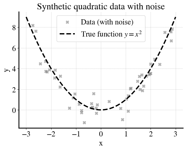
In this example we generate noisy data from a quadratic true function:
As a first example, we have \(m=50\) measurements.
Code
# Reproducibilityrng = np.random.default_rng(42)# --- Generate synthetic data (quadratic + noise) ---m =50X = rng.uniform(-3, 3, size=(m, 1))y_true = X[:,0]**2y = y_true + rng.normal(0, 1.0, size=m) # add Gaussian noise# --- True function (dense grid for smooth curve) ---xs = np.linspace(-3, 3, 200).reshape(-1,1)f_x = xs[:,0]**2# --- Simple plot ---plt.figure(figsize=(7,5))plt.scatter(X, y, marker="x", color="gray", alpha=0.6, label="Data (with noise)")plt.plot(xs, f_x, "k--", label="True function $y=x^2$")plt.xlabel("x")plt.ylabel("y")plt.title("Synthetic quadratic data with noise")plt.legend()plt.grid(True, linestyle=":")plt.show()
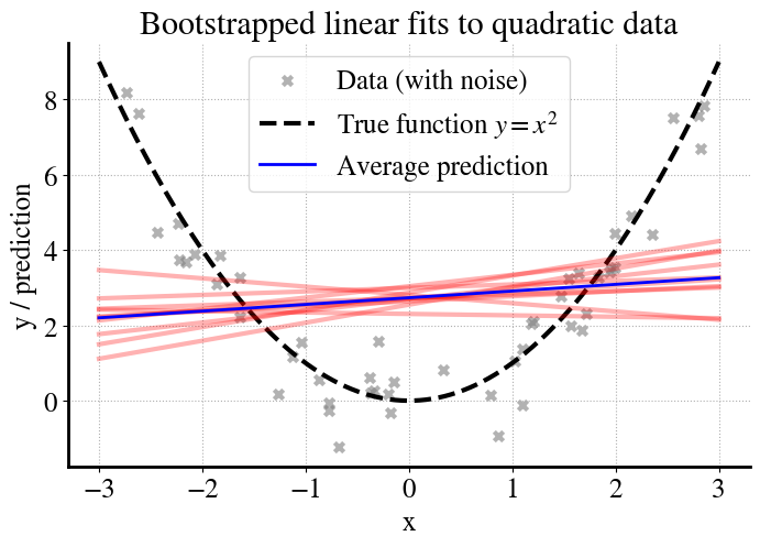
We then fit a much simpler linear model (\(y = \theta_0 + \theta_1 x\)) to this data, which cannot capture the curvature of the true function. To understand the model’s behavior, we use bootstrapping:
From the original dataset of \(m\) points, we create \(B\) different bootstrap samples (resampled datasets of size \(m\), drawn with replacement).
We train a separate linear regression model on each bootstrap sample.
We plot the predictions of each model (red lines).
We plot the average of all those individual predictions (blue lines).
Code
# --- Bootstrapping fits ---B =10preds = []for b inrange(B): X_res, y_res = resample(X, y, replace=True, random_state=42+b) model = LinearRegression().fit(X_res, y_res) preds.append(model.predict(xs))preds = np.array(preds)y_pred_avg = preds.mean(axis=0)# --- Plot ---plt.figure(figsize=(8,5))# Data + true functionplt.scatter(X, y, marker="x", color="gray", alpha=0.6, label="Data (with noise)")plt.plot(xs, f_x, "k--", label="True function $y=x^2$")# Bootstrapped model fitsfor b inrange(B): plt.plot(xs, preds[b], color="red", alpha=0.3)# Average prediction across bootstrapsplt.plot(xs, y_pred_avg, color="blue", linewidth=2, label="Average prediction")plt.xlabel("x")plt.ylabel("y / prediction")plt.title("Bootstrapped linear fits to quadratic data")plt.legend()plt.grid(True, linestyle=":")plt.show()
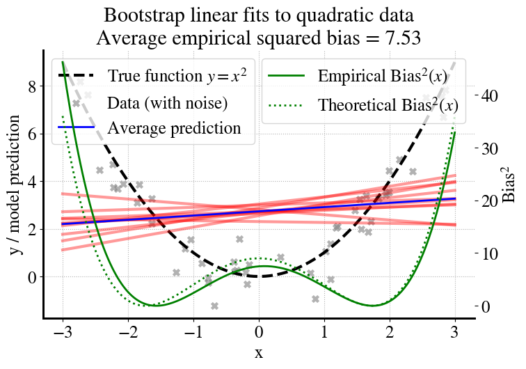
Now we can compute the bias, which essentially measures how far the blue line (average of predictions, linear in this example) from the dashed black line for the true function (without noise). For this particular extremely simple example, the ‘best’ linear fit is actually one with a slope of zero (as you should realize from the symmetry of the quadratic function), so we can also compute what the bias would be if we had an infinite number of measurements (shown as dotted line and right axis).
Code
# --- Empirical bias^2 curve ---bias_sq_curve = (y_pred_avg - f_x)**2avg_bias_sq = bias_sq_curve.mean()# --- Theoretical bias^2 curve (uniform on [-3,3]) ---L =3theta0 = L**2/3# constant fit over [-L,L]theta1 =0theoretical_pred = theta0 + theta1*xs[:,0]theoretical_bias_sq = (theoretical_pred - f_x)**2# --- Plot ---fig, ax1 = plt.subplots(figsize=(8,5))# Left y-axis: function, data, and model fitsax1.plot(xs, f_x, "k--", label="True function $y=x^2$")ax1.scatter(X, y, marker="x", color="gray", alpha=0.6, label="Data (with noise)")for b inrange(B): ax1.plot(xs, preds[b], color="red", alpha=0.4)ax1.plot(xs, y_pred_avg, color="blue", linewidth=2, label="Average prediction")ax1.set_xlabel("x")ax1.set_ylabel("y / model prediction")ax1.legend(loc="upper left")ax1.grid(True, linestyle=":")# Right y-axis: bias^2 curvesax2 = ax1.twinx()ax2.plot(xs, bias_sq_curve, color="green", linewidth=2, label="Empirical Bias$^2(x)$")ax2.plot(xs, theoretical_bias_sq, "g:", linewidth=2, label="Theoretical Bias$^2(x)$")ax2.set_ylabel("Bias$^2$")ax2.legend(loc="upper right")plt.title(f"Bootstrap linear fits to quadratic data\nAverage empirical squared bias = {avg_bias_sq:.2f}")plt.savefig("/content/bias.pdf", format="pdf", bbox_inches="tight")files.download("/content/bias.pdf")plt.show()
To summarize, what do we see in the above figure?
Gray crosses: noisy data points sampled from the quadratic function.
Black dashed line: the true function \(f(x)=x^2\) (what we wish we could learn).
Red lines: individual linear models fit on different bootstrap samples.
Blue line: the average prediction across all bootstrap models.
Green curve (right axis): the squared bias \[
\text{Bias}^2(x) = \big( \overline{\hat{y}(x)} - f(x) \big)^2
\] showing how far the average model is from the true function, and the similar dotted curve is the bias for \(m\rightarrow \infty\).
Bias for Increasing \(m\), and Learning Curves for Training and Validation Data
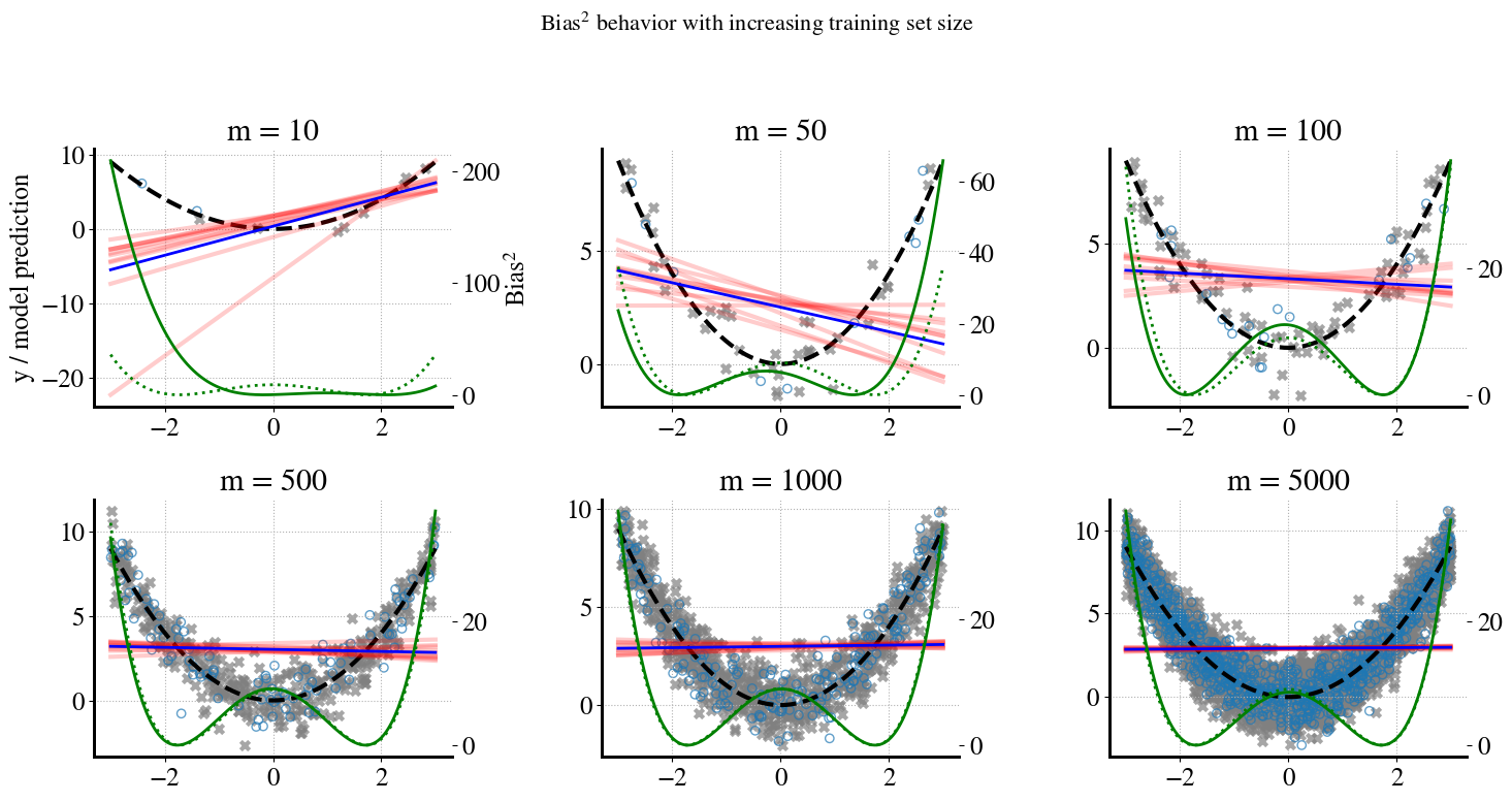
Next, let’s explore whether we can reduce the bias by using more measurements, i.e., more training data. We’ll try \(m=[10, 50, 100, 200, 500, 1000, 2000, 5000]\).
Furthermore, for each value of \(m\), we will also split our measurements into 80% for training data that we fit our linear models to and 20% of validation data that we don’t use for model fitting but only to check the accuracy of our final model from linear regression.
Through this approach, we can construct a learning curve of how our model improves with more and more data, both in terms of performance on training data and on validation data.
Below, you can see similar ‘messy’/information-rich plots for \(m=[10, 50, 100, 500, 5000]\) where \(m=[200, 1000, 2000]\) are only used to fill in some values in the learning curve.
In case you haven’t realized yet, we’re running a lot of regression models here, 80 models in total: 8 values of \(m\) (amount of training data) and for each of those we run \(B=10\) bootstrapping regressions.
Let’s see what the results look like:
Code
# Reproducibility# --- True function ---def f(x):return x**2# --- Experiment parameters ---m_panels = [10, 50, 100, 500, 1000, 5000] # shown as panelsm_extra = [200, 2000] # only for learning curvem_values = m_panels + m_extraB =10# bootstraps per mxs = np.linspace(-3, 3, 200).reshape(-1,1)f_x = f(xs[:,0])# Store learning curve datatrain_bias_list = []test_bias_list = []# Theoretical bias² curve for uniform [-3,3]L =3theta0 = L**2/3theoretical_pred = np.full_like(xs[:,0], theta0)theoretical_bias_sq_curve = (theoretical_pred - f_x)**2theoretical_bias_mean = theoretical_bias_sq_curve.mean()# --- Set up figure for bootstrap panels ---fig, axes = plt.subplots(2, 3, figsize=(15,8))axes = axes.ravel()for j, m inenumerate(m_values):# Generate dataset (with noise) X = rng.uniform(-3, 3, size=(m, 1)) y = f(X[:,0]) + rng.normal(0, 1.0, size=m)# Split into train/test (80:20) X_train, X_test, y_train, y_test = train_test_split( X, y, test_size=0.2, random_state=0 )# Bootstrap fits preds = []for b inrange(B): X_res, y_res = resample(X_train, y_train, replace=True, random_state=42+b) model = LinearRegression().fit(X_res, y_res) preds.append(model.predict(xs)) preds = np.array(preds) y_pred_avg = preds.mean(axis=0)# --- Bias² curves --- bias_sq_curve = (y_pred_avg - f_x)**2# Train bias² (average over training inputs) train_bias_sq = np.mean((model.predict(X_train) - f(X_train[:,0]))**2)# Test bias² (average over test inputs) test_bias_sq = np.mean((model.predict(X_test) - f(X_test[:,0]))**2) train_bias_list.append(train_bias_sq) test_bias_list.append(test_bias_sq)# --- Only plot panels for selected m values ---if m in m_panels: panel_idx = m_panels.index(m) ax = axes[panel_idx] ax.plot(xs, f_x, "k--", label="True function $y=x^2$") ax.scatter(X_train, y_train, marker="x", color="gray", alpha=0.7, label="Train data") ax.scatter(X_test, y_test, marker="o", facecolors="none", edgecolors="C0", alpha=0.7, label="Test data")for b inrange(B): ax.plot(xs, preds[b], color="red", alpha=0.2) ax.plot(xs, y_pred_avg, color="blue", linewidth=2, label="Avg. model prediction")# Bias² curves (empirical + theoretical) ax2 = ax.twinx() ax2.plot(xs, bias_sq_curve, color="green", linewidth=2, label="Empirical Bias$^2(x)$") ax2.plot(xs, theoretical_bias_sq_curve, "g:", linewidth=2, label="Theoretical Bias$^2(x)$") ax.set_title(f"m = {m}")if panel_idx ==0: ax.set_ylabel("y / model prediction") ax2.set_ylabel("Bias$^2$") ax.grid(True, linestyle=":")plt.suptitle("Bias$^2$ behavior with increasing training set size", fontsize=16)plt.tight_layout(rect=[0, 0, 1, 0.95])plt.savefig("/content/bias_panels.pdf", format="pdf", bbox_inches="tight")files.download("/content/bias_panels.pdf")plt.show()
So how should you interpret the above plots?
You can see that for small amounts of training data (small \(m\)), the model predictions vary a lot depending on the randomness of picking a sample of, say, \(m=10\) or \(m=50\) measurements. Remember that we actually only use 80% of \(m\) for training, i.e. to do the linear regressions. For increasing amounts of data, there is much less variation in the model predictions for different random samples (the bootstrapping). That is good. However, obviously, the linear predictions do not become any better in predicting the true quadratic behavior of the data. No amount of additional training data will fix this. This is expressed by the ‘w’-shaped bias curves in the bottom, which converge to the dotted theoretical bias for \(m\rightarrow \infty\).
A Different Type of Learning Curve
A much easier way to show all this in practice is by plotting the learning curves for the above ML models. This is a different type of learning curve from what be used before. Before, we looked at learning curves where we plotted how the error of our models (MSE or logistic cost function) reduced with the number of iterations of, e.g., gradient descent methods. Here, we look at how errrors reduce with increasing amounts of training data (and proportionally, validation data). Typically, this is done for the full MSE error, but we can also use this to look at the individual contributions of bias, variance, and irreducible measurement noise.
A key aspect of interpretting this type of learning curve is to compare the errors on training data to those on validation data. For a perfectly good model, it is quite normal that for small \(m\), errors on validation data are (much) larger than on training data. We fit only to the training data, so the MSE on training data is by definition as small as it can be (for a given model), and the error on validation data expresses whether the model generalizes well to new data/measurements.
For a ‘good’ model, you should expect the learning curves on training and validation data to converge as you increase \(m\). Ideally, they should both converge to MSE=0. If that doesn’t happen, it is due to some combination of those bias, variance, and irreducible noise terms (the latter cannot be reduced by any ML model, only by better measurements).
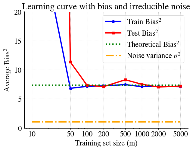
Let’s have a look at the learning curves for just the bias from the above experiments. I’ll also add in the irreducible error (\(\sigma^2\)), which is known from how we constructed the noise to begin with.
The trend is perhaps not super clear because for \(m=10\) we may get lucky in the sense that a linear fit to the 2 validation points (20% of \(m=10\)) may be a bit better than the 10 regressions results (bootstrapping) on the other 8 points (this all depends on random draws, so can be different each time you run this notebook). For \(m=50\) we see the more typical behavior where errors on training data are lower than on validation data. But this, of course, is an unusual/weird example, because a linear fit to quadratic data will never really generalize well. For reference, I’m also showing the measurement noise term and you can see the asymptotic values of both printed: bias\(^2= 7.4\) and irreducible noise variance \(\sigma^2 = 1\).
Some key take-away points from all this are:
For large \(m\), we see similar performance on training and validation data, which is generally good, but it converges to some high MSE, dominated in this case by the bias term.
\(\sigma^2\) can never be reduced by ML alone.
Bias (underfitting) can only be reduced by considering a more complex model.
In this case, that would of course be a quadratic model instead of linear. Or we could try a high-order polynomial and try and figure out which order is optimal. More generally, higher complexity can also just mean more features (remember, we treat polynomial terms just like any linear feature). If you remember the Ames housing prices labs, you may see high bias if you try predict house prices from just a small number of features and see the bias reduce when you add in more and more of the features, all while still using only linear dependencies.
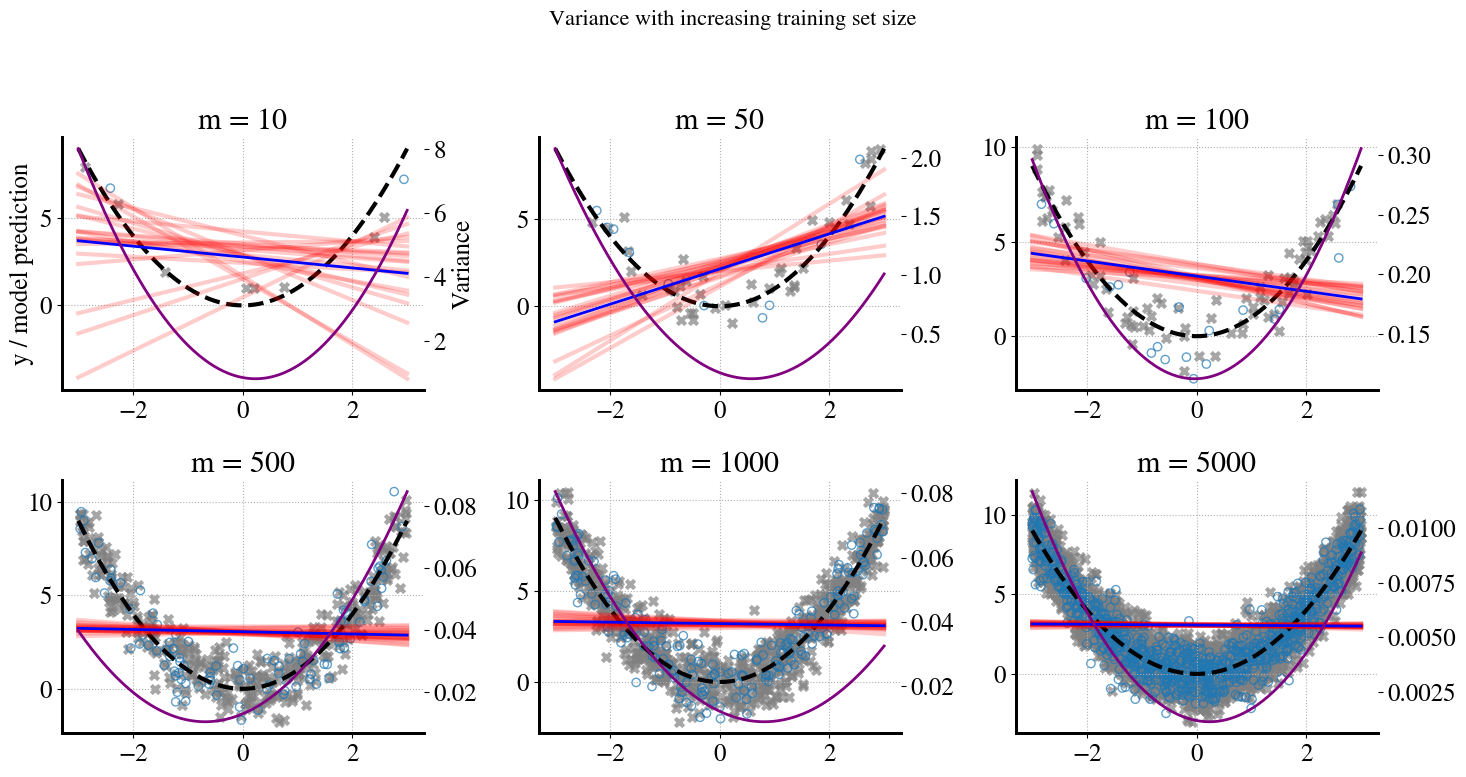
To complete this analysis, let’s also see how the variance behaves for this illustrative example.
Remember, the variance is a measure of the spread of the red lines (individual linear model predictions) around the blue line, which is the average of all those (bootstrapped) predictions. The definition is exactly the same as for MSE, i.e. the sum of the squared difference between the red lines and the blue one for each value of \(x\) (summed in the end over all \(m\) values of \(x\)).
For \(m=10\), you can see that there is more spread in the linear predictions at low \(x\) than at high \(x\), which is reflected in the asymmetric variance curve in the bottom. At higher values of \(m\), i.e. more training data, the spread in predictions reduces and you can therefore see that the range of the right vertical axis gets smaller and smaller.
Most importantly, when you look at the learning curves for just the variance for this case in the separate bottom figure, you see that the variance quickly reduces to zero for this scenario.
In short, this is an illustration of a high-bias, low-variance ML model, which is indicative of underfitting.
Illustration of (Low-Bias,) High-Variance ML Problem
As explained above, high variance is an indication of overfitting. So let’s look at an example where we are clearly overfitting. We have seen this problem emerge in several lectures and labs when using a very high order polynomial (non-linear regression) to fit data that are in fact of a much lower polynomial order. The simplest example would be exactly the oposite of the previous one: fitting a quadratic model to linear data.
Instead, to mix it up just a little bit, let’s keep the exact same data for consistency. In other words, we again consider the quadratic true relation plus some synthetically generated measurement noise. But now, instead of fitting with the ‘correct’ quadratic model, we investigate in detail what happens when we don’t know the correct model and try a higher-order polynomial. Let’s not go too crazy and just try a 6th order polynomial model.
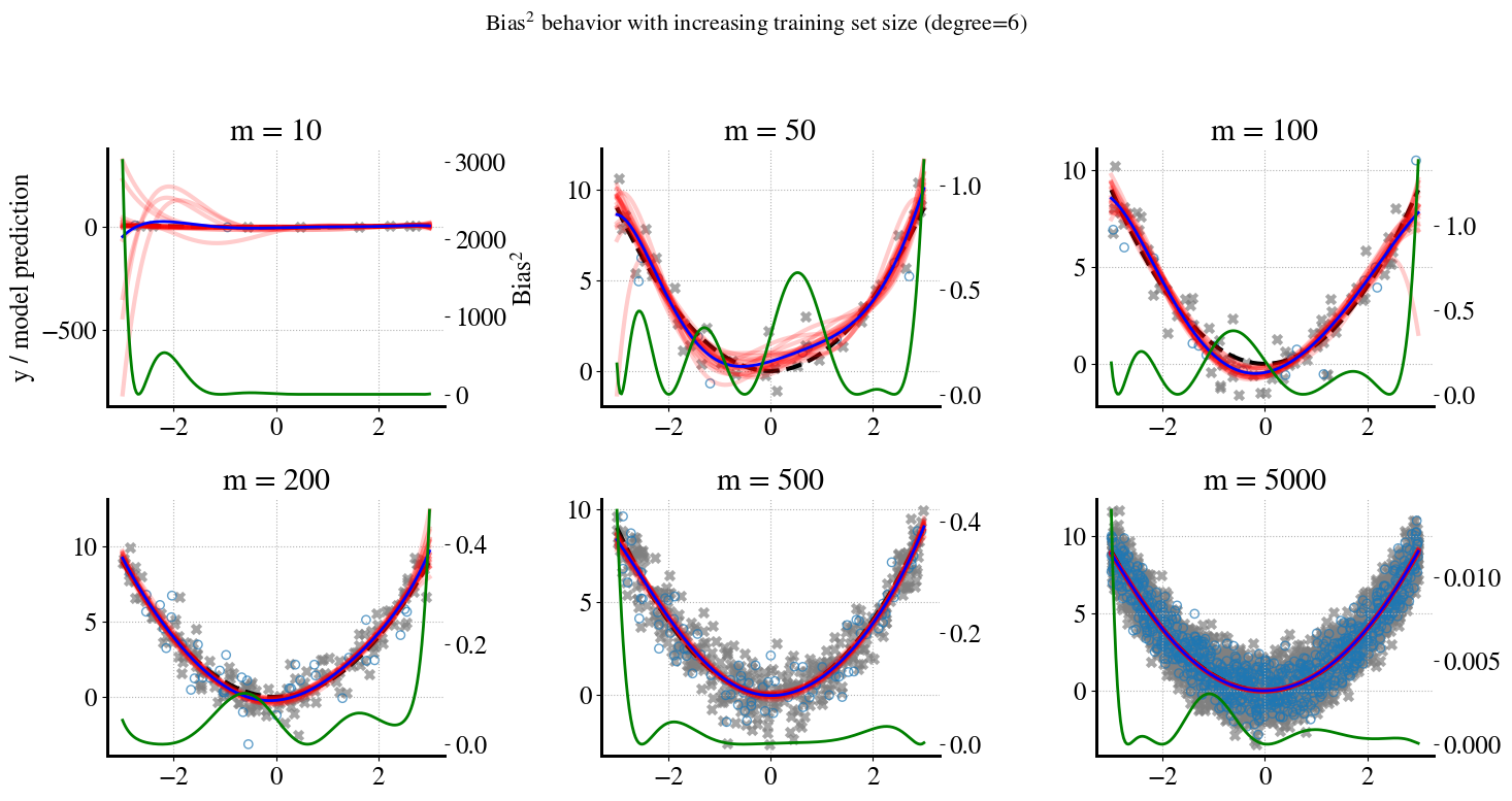
Below, I generate similar panels as we did for the bias above and see what the variance looks like and how it changes as we increase the number of training data (proporitional to \(m\)).
Code
# Reproducibility# --- True function ---def f(x):return x**2# --- Experiment parameters ---m_panels = [10, 50, 100, 500, 1000, 5000] # shown as panelsm_extra = [200, 2000] # only for learning curvem_values = m_panels + m_extraB =20# bootstraps per mdegree =6# polynomial degreexs = np.linspace(-3, 3, 200).reshape(-1,1)f_x = f(xs[:,0])# Store learning curve datatrain_var_list = []test_var_list = []# Store coefficients (mean and std from bootstrap)coef_mean = []coef_std = []# --- Figure 1: bootstrap panels ---fig, axes = plt.subplots(2, 3, figsize=(15,8))axes = axes.ravel()for j, m inenumerate(m_values): t0 = time.time()# Generate dataset (with noise) X = rng.uniform(-3, 3, size=(m, 1)) y = f(X[:,0]) + rng.normal(0, 1.0, size=m)# Train/test split X_train, X_test, y_train, y_test = train_test_split( X, y, test_size=0.2, random_state=0 )# Bootstrap fits (store all predictions at once + coeffs) preds_grid, preds_train, preds_test = [], [], [] coef_bootstrap = []for b inrange(B): X_res, y_res = resample(X_train, y_train, replace=True, random_state=42+b) model = make_pipeline(PolynomialFeatures(degree=degree, include_bias=False), LinearRegression()).fit(X_res, y_res) preds_grid.append(model.predict(xs)) preds_train.append(model.predict(X_train)) preds_test.append(model.predict(X_test)) coef_bootstrap.append(model.named_steps['linearregression'].coef_) preds_grid = np.array(preds_grid) preds_train = np.array(preds_train) preds_test = np.array(preds_test) coef_bootstrap = np.array(coef_bootstrap) # shape (B, degree)# Average prediction (for plotting) y_pred_avg = preds_grid.mean(axis=0)# Variance curves var_curve = preds_grid.var(axis=0) train_var = preds_train.var(axis=0).mean() test_var = preds_test.var(axis=0).mean() train_var_list.append(train_var) test_var_list.append(test_var)# Store coefficient stats coef_mean.append(coef_bootstrap.mean(axis=0)) coef_std.append(coef_bootstrap.std(axis=0))# --- Only plot panels for selected m values ---if m in m_panels: panel_idx = m_panels.index(m) ax = axes[panel_idx] ax.plot(xs, f_x, "k--", label="True function $y=x^2$") ax.scatter(X_train, y_train, marker="x", color="gray", alpha=0.7, label="Train data") ax.scatter(X_test, y_test, marker="o", facecolors="none", edgecolors="C0", alpha=0.7, label="Test data")for b inrange(B): ax.plot(xs, preds_grid[b], color="red", alpha=0.2) ax.plot(xs, y_pred_avg, color="blue", linewidth=2, label="Avg. model prediction")# Variance curve ax2 = ax.twinx() ax2.plot(xs, var_curve, color="purple", linewidth=2, label="Variance$(x)$") ax.set_title(f"m = {m}")if panel_idx ==0: ax.set_ylabel("y / model prediction") ax2.set_ylabel("Variance") ax.grid(True, linestyle=":") t1 = time.time()print(f"Finished m={m} in {t1 - t0:.2f} seconds")plt.suptitle(f"Variance behavior with increasing training set size (degree={degree})", fontsize=16)plt.tight_layout(rect=[0, 0, 1, 0.95])plt.savefig("/content/variance_panels.pdf", format="pdf", bbox_inches="tight")gfiles.download("/content/variance_panels.pdf")plt.show()
Finished m=10 in 0.11 seconds
Finished m=50 in 0.44 seconds
Finished m=100 in 0.16 seconds
Finished m=500 in 0.16 seconds
Finished m=1000 in 0.14 seconds
Finished m=5000 in 0.43 seconds
Finished m=200 in 0.14 seconds
Finished m=2000 in 0.12 seconds
These messy and wildly different plots are a nice illustation of issues you’ve seen before.
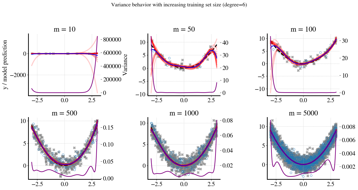
To remind you what’s happening during this bootstrapping.
Starting with the first plot. We have \(m=10\), but set aside 20% for validation (2 points), so we only have 8 data points to fit our 6th-order polynomial model(s) to. In the bootstrap sampling, we take 10 different samples of 8 points but ‘with replacements’, which means that in each iteration/sample, some points will be duplicate and some will be missing. When the ‘missing points’ are ‘in the middle’ of the full range of \(x\) values, we’re essentially interpolating and you can see that all the \(B=10\) bootstrapped 6th order predictions are fairly close to each other in the middle. However, when the missing points are at the left or right extremities of the \(x\) range, we are extrapolating and that’s where you can see our 6th order polynomial predictions randomly ‘shooting off’ to very high or low values.
This behavior is exactly what’s captured by the variance, which tends to be (very) high for the smallest and larges \(x\) values and low for intermediate \(x\) values.
In addition, overly complex models (like high order polynomials) try to fit the ‘wiggles’ between noisy measurement points. For small amounts of training data, each random sample has different such wiggles between the measurement points. But for larger and larger amounts of training data, the wiggles (spread/variance) in any sample of the training data will be very similar; and the same is true for the validation data. Also, samples of both training data and validation are more likely to span the full range of possible \(x\) values as we increase the amount of measurements.
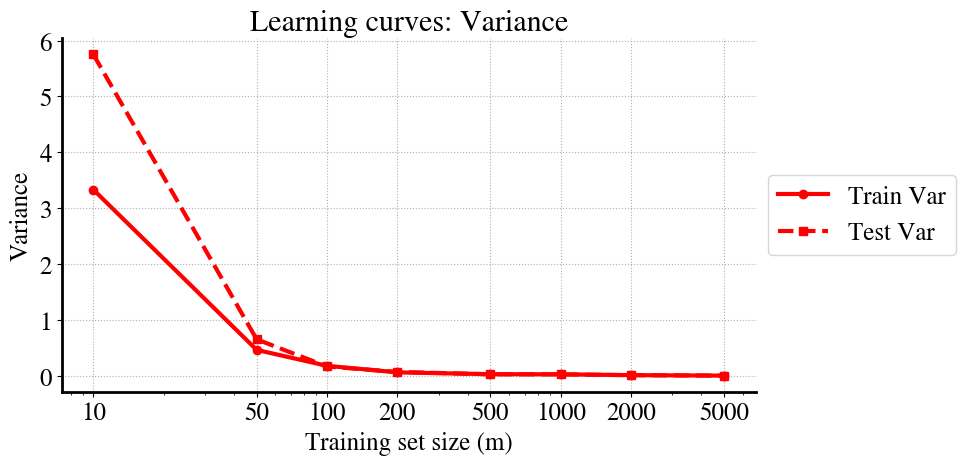
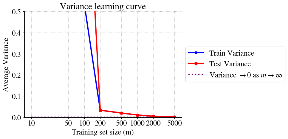
As a result of all this, you can see that, first, the variance in training and validation data converge (in other words, model predictions are just as good for unseen validation data as for the training data). And second, you see that the variance reduces to zero as \(m\) increases, ultimately, to infinity.
We can see this again most clearly/easily in the learning curves. The variance at very low \(m\) is so large that I cut off the vertical axis range. You can see that at \(m=100\) the performance on training and validation data is already about the same, which is generally good, but the variance of both is still high. Somewhere between \(m=2000\) - \(5000\) it looks like the variance reduces to nearly zero.
So what does that mean? Is the model suddenly not overfitting anymore when we increase \(m\)?
Actually, yes, that is correct! For small \(m\), the higher order terms try to wiggle to fit the random deviations of measurement points (irreducible error). But as \(m\) increases, there are so many of such noisy points that the model can’t ‘decide’ whether is should move up or down a bit to fit one pointm because for each point that’s a bit higher than \(f(x)=x^2\) there will be another one that’s a bit lower and for each value of \(x\), our polynomial model can only fit one value of \(y\).
As a result, the high-order terms automatically reduce as we increase the amount of (noisy) data.
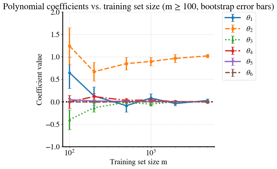
In case you don’t believe me, let’s ‘prove’ this with another visualization. Below, I’m plotting the fitting parameters \(\theta_1\ldots \theta_6\) for our 6th order polynomial model for each value of \(m\). To be extra fancy, there are also error bars that show the range of those values for \(\theta_i\) across each of the \(B=10\) bootstrapped samples.
Code
# --- Figure 2: Coefficient evolution (sorted, clean, colorblind-friendly) ---coef_mean = np.array(coef_mean) # shape (len(m_values), degree)coef_std = np.array(coef_std)m_all = np.array(m_values)# Sort by morder = np.argsort(m_all)m_sorted = m_all[order]coef_mean_sorted = coef_mean[order]coef_std_sorted = coef_std[order]# Only keep points with m >= 100mask = m_sorted >=100m_plot = m_sorted[mask]coef_mean_plot = coef_mean_sorted[mask]coef_std_plot = coef_std_sorted[mask]# Different markers/linestyles for accessibilitymarkers = ["o", "s", "^", "D", "v", "P"]linestyles = ["-", "--", ":", "-.", "-", "--"]plt.figure(figsize=(10,6))for d inrange(degree): # degree=6 → indices 0..5 plt.errorbar( m_plot, coef_mean_plot[:, d], yerr=coef_std_plot[:, d], marker=markers[d %len(markers)], linestyle=linestyles[d %len(linestyles)], capsize=4, label=f"$\\theta_{d+1}$", )plt.axhline(0, color="k", linestyle=":")plt.xlabel("Training set size m")plt.ylabel("Coefficient value")plt.title("Polynomial coefficients vs. training set size (m ≥ 100, bootstrap error bars)")plt.xscale("log")plt.ylim([-1, 2]) # tighter cut-off to keep plot readableplt.grid(True, linestyle=":")# Legend outside the plotplt.legend(bbox_to_anchor=(1.05, 1), loc="upper left", borderaxespad=0.)plt.tight_layout(rect=[0, 0, 0.8, 1]) # leave space on the rightplt.savefig("/content/coefficients_vs_m.pdf", format="pdf", bbox_inches="tight")gfiles.download("/content/coefficients_vs_m.pdf")plt.show()
How cool is that? You can see how at small \(m\) each of the polynomial terms can contribute significantly (especially of course for the smallest \(m=10\)), and over quite a range for different bootstrap samples (size of the error bars). However, for the largest \(m=5000\), \(\theta_1\) (linear term) and \(\theta_3\ldots \theta_6\) all go to zero with very small error bars, and the only surviving term is \(\theta_2=1\), which is exactly our quadratic model!
While this is pretty great, it is not a practical solution to overfitting in practice. If we could eliminate overfitting by simply having \(m=5000\) datapoints, that would be wonderful. However, this only works because we considered a super simple univariate non-linear regression problem. Machine/deep learning deals with complex problems that have hundreds, millions, billions of features (e.g. number of pixels in satellite imagery) and we can typically never get to the $m$ regime.
The purpose of this entire lecture/week is to introduce you to another solution that works at smaller \(m\), called regularization.
You’ll have to be patient a little bit longer, though, while discussing a few more details that will help you understand and appreciate how regularization works.
First, of course in practice we usually don’t only have bias or only variance, but rather we can have high-bias/low-variance or low-bias/high-variance (or in between). Just like I showed the (low) variance for the high-bias example of fitting linear models to quadratic data, let’s quickly look at what the (low) bias is for the high-variance situation of fitting a high-order polynomial to the same quadratic data.
Finished m=10 in 0.09 seconds
Finished m=50 in 0.08 seconds
Finished m=100 in 0.33 seconds
Finished m=200 in 0.10 seconds
Finished m=500 in 0.12 seconds
Finished m=5000 in 0.16 seconds
Finished m=1000 in 0.11 seconds
Finished m=2000 in 0.08 seconds
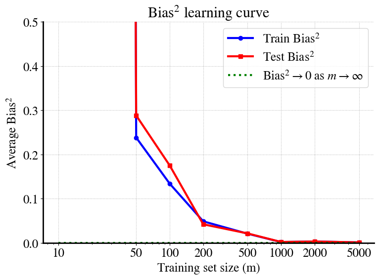
Let me remind you again, the bias is the (squared) difference between the averaged model predictions (blue line) and the true quadratic function. In the plots for different \(m\) in the top, the bias may look like it’s varying widly, but pay attention to the small numbers of the vertical right axis. Even for the low-\(x\) and high-\(x\) values, while the polynomial predictions vary a lot (because of extrapolation), their average (blue line) is much more stable.
Really, all we need is to look at the learning curves:
The take-away point is that even for small values of \(m\), e.g. \(m=50\), the bias contribution to the MSE is negligible (smaller than the measurement noise).
As mentioned, this is a clear example of a low-bias/high-variance problem.
Summary: Bias, Variance, and Irreducible Noise
Bias: Systematic error from model misspecification or limited flexibility.
Variance: Sensitivity of the learned model to the sampled training set. Bootstrap bands and learning curves show variance shrinking as the number of training points increases.
Irreducible noise: Random observation noise that cannot be reduced by modeling — it sets a floor to achievable error.
Key takeaways 1. With small \(m\), high‑order models can have large variance (wiggly fits). 2. As \(m\) grows, prediction variance decreases and higher‑order coefficients stabilize. 3. Low variance with large \(m\) doesn’t automatically mean the model is simplest; regularization (ridge/lasso) explicitly prefers simpler solutions and reaches stability with fewer samples.